Quiet Elegance, Confidently Understated
Today we explore Neutral Palette Mastery for Elegant, Low-Profile Living Spaces, translating soft hues into calm, resilient rooms. You’ll learn how undertones, texture, and light shape depth without visual noise, with real-life examples, small-space tricks, and choices that age gracefully. Think cozy sofas with slim silhouettes, nuanced whites that never feel cold, accents that hum rather than shout, and habits that keep everything fresh. Read, save, ask questions, and share your own transformations.

Color Nuance That Calms Without Boredom
Neutral does not mean flat; it means orchestrating undertones so shadows feel intentional and daylight reads gentle. By pairing warm greiges with faintly cool whites, you create a balanced field where wood tones glow and metals soften. I once refreshed a rental with nothing but balanced trim and wall pairings, and the room felt taller, quieter, and kinder to evening lamps. We’ll decode combinations that look effortless on busy weekdays.


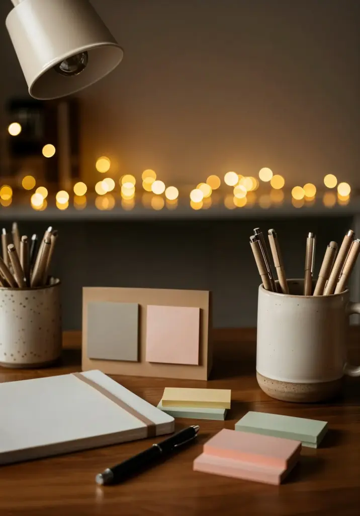
Textures That Whisper Luxury
Texture carries emotion when color stays quiet. Pair boucle with brushed cotton, woven jute with honed stone, and a single polished brass accent for a soft glimmer. When clients hesitate about neutrals feeling sterile, adding handfeel solves it instantly. Imagine winter mornings with thick wool underfoot and summer breezes lifting lightweight sheers. We’ll curate combinations that photograph beautifully yet welcome bare feet and everyday life.
Light, Shadow, and Serene Contrast
Light defines neutrals more than pigment. North-facing rooms skew cool and gray; south-facing spaces can make creams feel sun-kissed. Plan layers: ambient overheads, task lamps, and a few warm pools for intimacy. Dimmers solve arguments between readers and TV watchers. In one bungalow, sheer-to-heavy pairs allowed rainy-day softness without sacrificing privacy. We’ll map glare, reflections, and cozy corners.
North vs. South Facing Realities
In northern light, choose creams with a breath of yellow or peach to avoid gloom. Southern exposure already warms paints; lean into balanced off-whites to prevent things turning syrupy. Track your room for a full day, photographing hourly; subtle shifts will surprise you. Adjust lamp temperatures accordingly, mixing 2700K warmth with 3000K clarity for realistic colors after dark.
Translucent Window Treatments
Sheers with a natural linen blend filter glare while keeping views. Mount them close to the ceiling to lengthen walls, then add a discreet roller for blackout moments. I love double rods for flexibility—morning optimism, evening cocoon. Choose ivory over optic white to soften outdoor green cast, especially around trees or courtyards, which can skew interiors unexpectedly cool.
Low-Profile Furniture That Grounds the Room
Pieces that sit lower visually stretch ceilings and create calm sightlines. Seek sofas with slim arms, raised legs, and tailored cushions; pair with round-edged tables to soften traffic paths. In a family loft, swapping one bulky sectional for two airy loveseats opened circulation and let the rug shine. We’ll prioritize comfort while keeping silhouettes light and breathable.
Art, Greenery, and Negative Space
Refined rooms need breathing room as much as beautiful objects. Curate fewer, larger pieces with textured detail rather than many small distractions. A pale mat around a charcoal drawing creates presence without shouting. Plants bring life while maintaining restraint when leaf shapes are sculptural. We’ll arrange vignettes that guide the eye and respect quiet expanses.

Monochrome Art with Texture
Charcoal, ink, or plaster reliefs keep the palette steady while adding dimension. If you cluster two pieces, leave generous spacing so the wall color participates. I love oversized mats in warm white, which frame the work and echo trims. The result feels gallery calm yet deeply personal, especially when paired with a single reading lamp.

Botanicals That Suit Quiet Rooms
Aim for architectural leaves and softly matte greens: olive trees, rubber plants, or a graceful ZZ thrive in restrained settings. Use simple, textural pots—unglazed ceramic, oiled terracotta—so foliage remains the hero. Elevate one plant on a low stand for layered height without crowding. Water discipline keeps soil tidy and prevents accidental mess in soft-toned spaces.
Styling Shelves Lightly
Let empty space do half the talking. Group by material—paper, ceramic, wood—then vary height with a single sculptural object. A trio of pale spines, a creamy bowl, and one matte candle can feel complete. Rotate seasonally, not constantly, to preserve calm. The shelf should look edited, inviting hands rather than demanding attention.
Practicality: Maintenance and Real Homes
Beautiful restraint must also survive muddy boots, coffee spills, and birthday glitter. We’ll choose durable finishes, washable fabrics, and cleaning rhythms that keep neutrals luminous. I’ll share the stain strategy that saved a cream rug during a pizza night, plus ways to disguise wear gracefully. Real life belongs here, without fear or fuss.

Kid- and Pet-Friendly Neutrals
Performance linen blends, microfiber suede, and solution-dyed acrylics resist stains while feeling inviting. Choose medium-light tones that hide lint better than ultra-dark or pure white. Pattern can be minimal—herringbone or subtle melange—to mask small mishaps. Slipcovers make deep cleaning easy, and washable rug pads add a quiet cushion that keeps silhouettes sleek and unrumpled.
Cleaning Routines That Preserve Soft Tones
Weekly dusting with microfiber prevents grayish buildup that dulls pale surfaces. Blot spills, never rub, and approach stains from the edge inward. Keep gentle soap, white cloths, and a small fan handy for quick drying. As a household ritual, fifteen mindful minutes restores clarity, protects finishes, and keeps your neutral sanctuary welcoming for spontaneous guests.
Budget Moves with High-End Calm
Spend where touch matters—sofa fabric, rug underfoot, drapery lining—then economize on casegoods with solid joinery and timeless lines. Paint is your multiplier: a well-chosen white unifies disparate pieces instantly. Hunt vintage for patina and scale, avoiding heavy ornament. The result feels curated, stable, and peaceful, not expensive for its own sake, but comfortable beyond trend cycles.
Make It Yours: Share Your Calm Space
Your home tells the story; our neutral approach simply gives it a gentle frame. Post your questions, request paint pairings, and share before‑and‑after photos so others can learn from your journey. Subscribe for new palettes, case studies, and shopping checklists. Together we can refine choices, avoid costly mistakes, and celebrate quiet progress.
All Rights Reserved.